Bricklane

Designing a brand for renters and instutitional investors
Scenario
During my time working as Marketing Director for Series-B Prop-Tech scale-up, Bricklane, I led the business through a full verbal and visual rebrand. Bricklane's proposition had shifted from D2C to B2B, and it needed an identity which reflected its commitment to making the rental market work meaningfully better.
Approach
I worked with Regular Practice and Sonder & Tell to highlight a sense of transparency, responsibility and resident brand, setting Bricklane apart by uniting renters and investors under a single cohesive brand rather than separating the two.
We knew that we needed to emphasise Bricklane's commitment to revolutionising the rental market through responsible investment, raising expectations of what renting should be one property at a time.

Results
An updated verbal identity, visual identity and website. The brand is typographically led with visual nods to blueprint scripts. The new dark green primary colour is confident and clear, while secondary colours add a sense of playfulness.
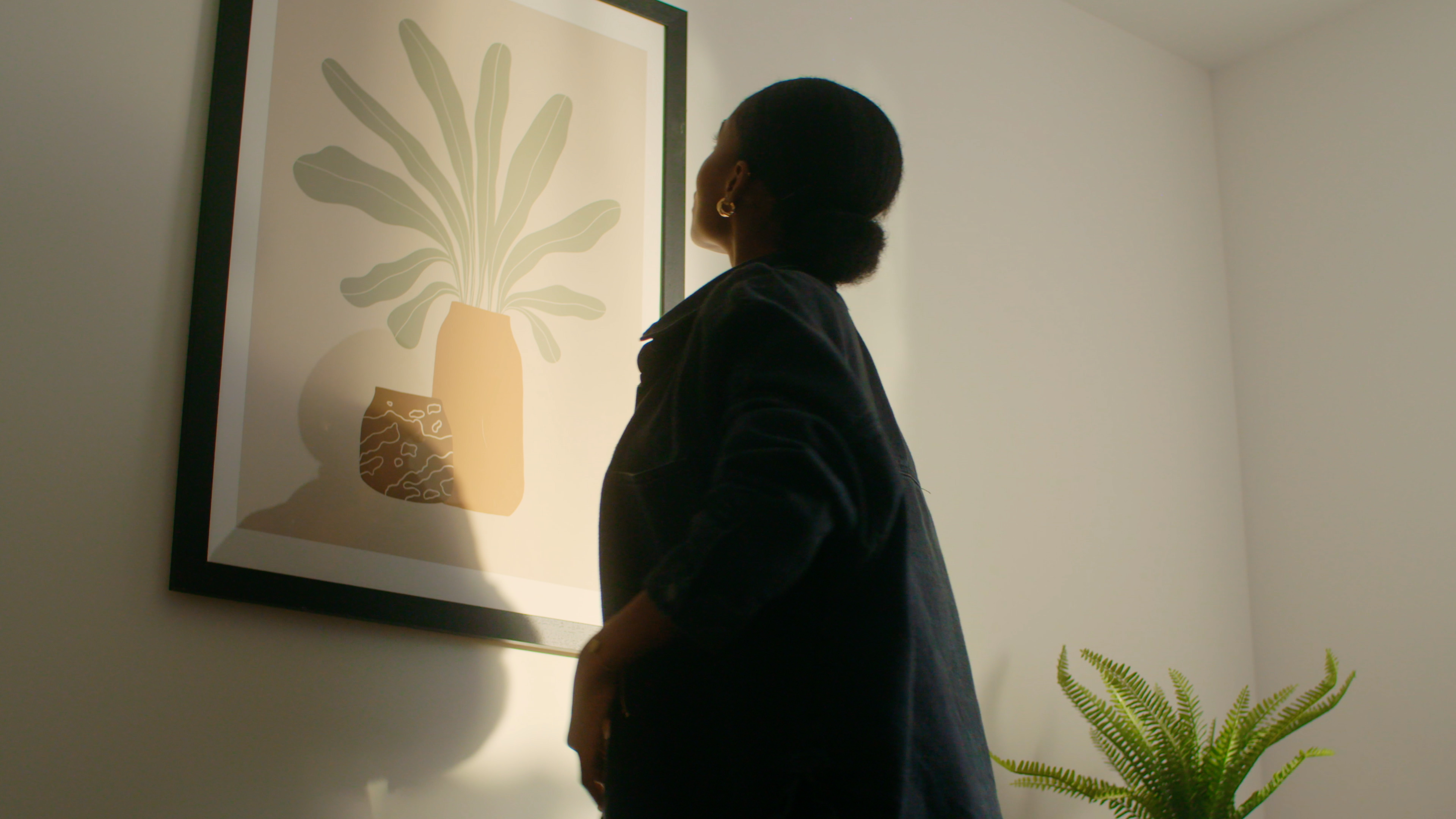
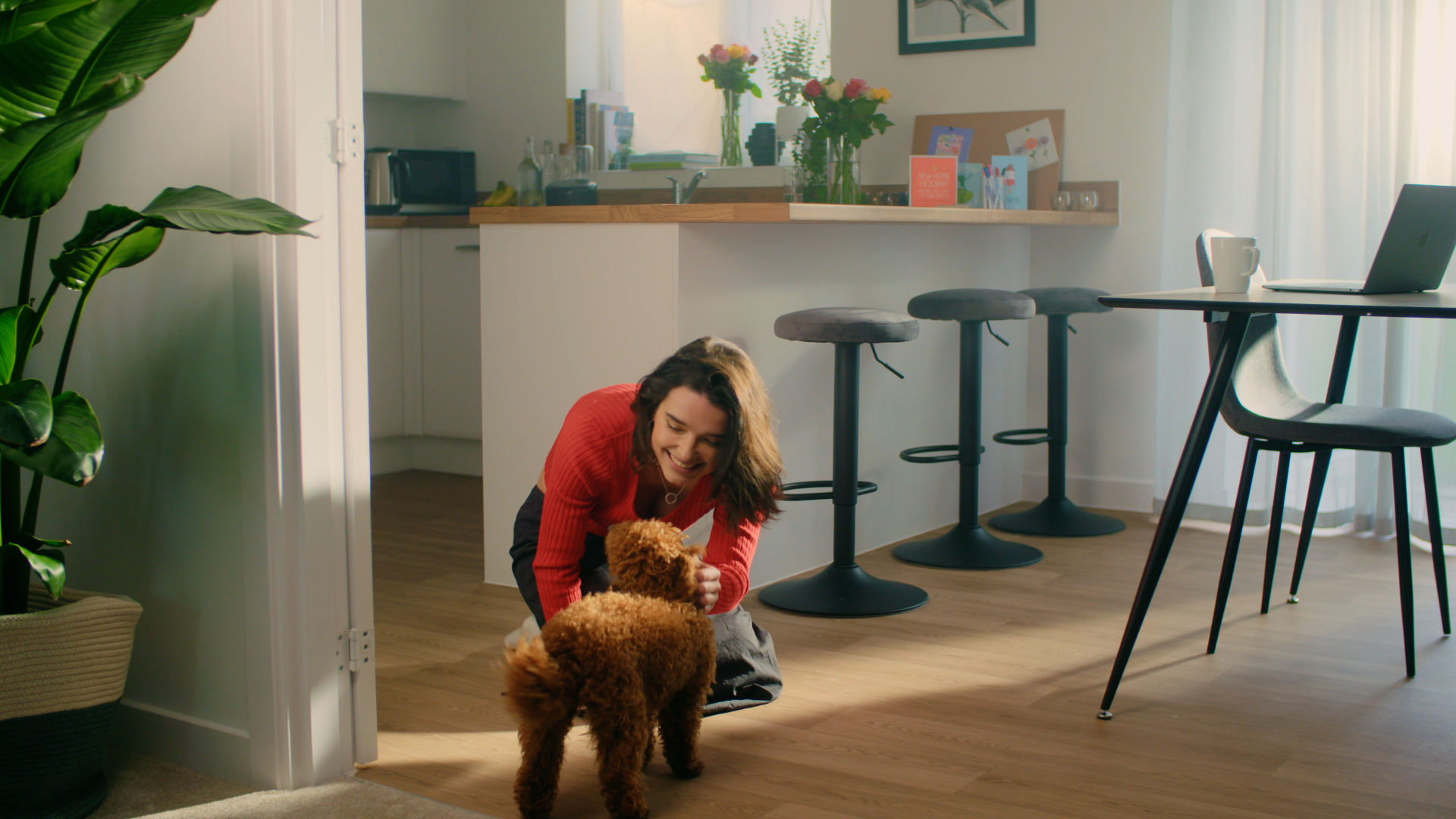
The art direction shows people actually living in their homes, not wistfully looking out of windows or into the mid distance. The photographic style is warm, and photos were all shot in a real Bricklane home with the actual furniture that renters could expect.